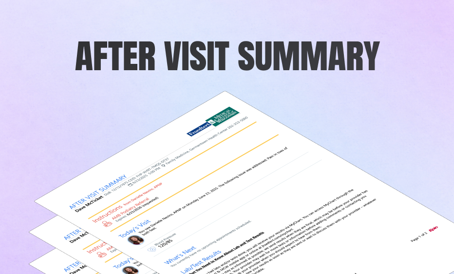
Transforming the After Visit Summary from a dense, 20-page compliance document into a personalized, AI-driven partner for patients.
Inception Health (Froedtert Hospital)
January 2025 - April 2025
Project Lead & Lead Product Designer
2 Frontend Engineers , 1 AI Engineer, 1 Designer and 1 UX Researcher
A patient sits at their kitchen table, hours after a pivotal oncology appointment. The adrenaline of the clinic has worn off, replaced by the heavy fog of a diagnosis. Across from them, a worried spouse asks a simple question: "So, what days do you have to go in for infusion? And are you allowed to eat beforehand?"
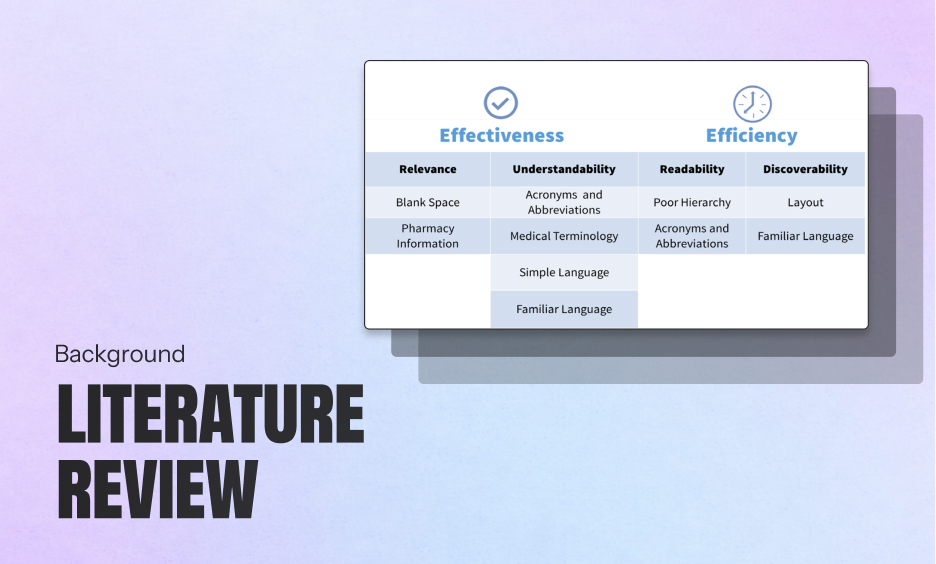
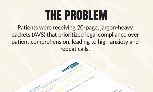
Somewhere in this stack is the answer, but to a terrified patient, it reads like a legal contract, not a care plan. The medical information is technically accurate, but it is buried under a mountain of data.
Defeated and feeling "stupid" for not knowing the answer, they pick up the phone to call the clinic. This simple act triggers a cascade of costs: a triage line is tied up, a nurse is pulled away from bedside care, and the patient’s anxiety spikes—all because the document designed to help them actually alienated them. It’s a cycle that plays out across health systems—driving patient anxiety, clinician burnout, and preventable mistakes.
Initially, my instinct was to simply "redesign the paper"—change the font, improve the layout, and use better headings. But I realized quickly that the problem wasn't cosmetic; it was systemic. The confusing text wasn't being written by a bad writer; it was being generated.
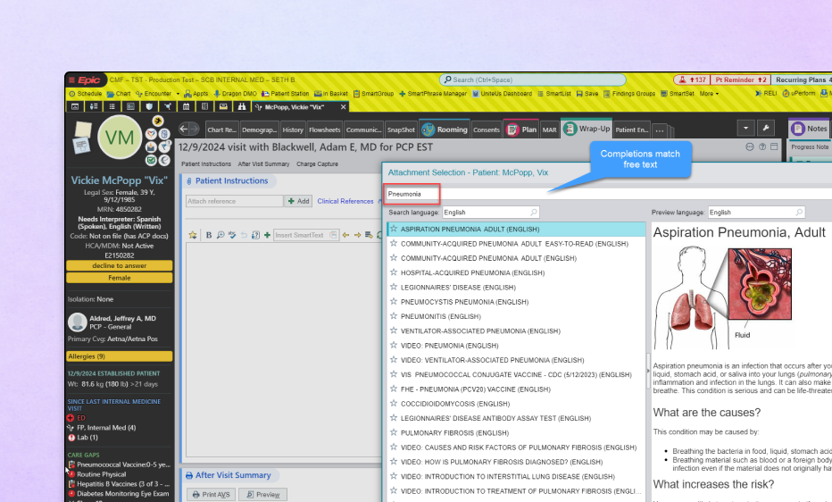
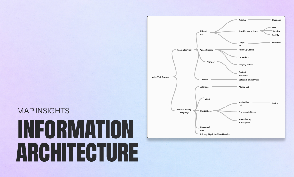
To fix the output, I had to interrogate the input. I went upstream to the source: Epic, our Electronic Health Record, and Elsevier, the content library that powers it. I needed to audit the actual data to answer a fundamental question: Why are we handing patients pages from a medical-grade textbook instead of simple instructions?
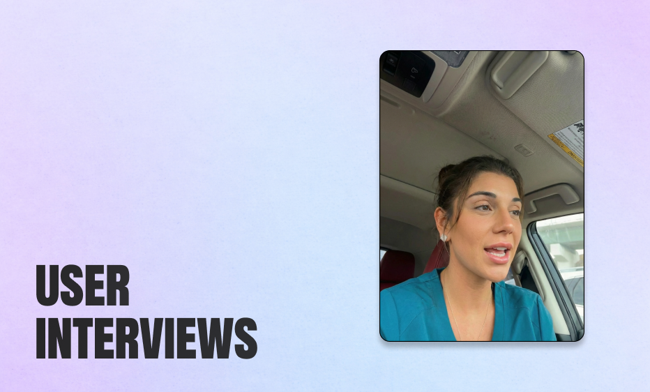
I sat watched providers work in Epic during real patient visits. What I saw changed the entire trajectory of the project.
The system then scrapes these disparate data inputs and stitches them together into a PDF known as the After Visit Summary. The resulting document is a "Frankenstein" of compliance text, billing codes, and generic warnings. It effectively protects the hospital from liability, but it completely fails to communicate care.
I realized that for a provider, Epic is less like a word processor and more like a fighter jet cockpit. Facing thousands of toggles and alerts with only 90 seconds between patients, they don't have the luxury of writing heartfelt notes. They simply select a diagnosis code and hit print. Crucially, I learned that most providers never actually read the explanation the system generates. They trust the software to explain the condition, unaware that it is often pasting in raw textbook definitions.
The problem wasn't that the doctors were cold. It was that the interface incentivized speed over clarity. If we wanted to fix the AVS, we couldn't ask doctors to slow down. We had to use AI to take that "Frankenstein" data and translate it back into a human narrative.
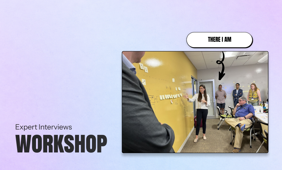
I needed to understand why a document that was legally "perfect" was failing so miserably in the real world. Through interviews and UX workshops with patients, providers, and administrators, we uncovered a fundamental misalignment. The AVS wasn't broken; it was doing exactly what it was designed to do—protect the institution. It just wasn't designed to help the patient.
Perhaps most critically, we found that this documentation gap was actively undoing the trust built during the appointment. A doctor might spend thirty minutes being empathetic, warm, and reassuring. But when the patient walks out with a robotic, impersonal stack of papers, that "cold" artifact overwrites the "warm" human memory. The AVS is effectively the "last word" of the encounter. By failing to mirror the empathy and clarity of the doctor’s actual voice, the document made patients feel processed rather than cared for, transforming a relationship-based interaction into a transactional one.
My design challenge was clear. It was to use AI to bridge that gap—turning "compliant data" into "comprehensible care" without adding a single second to the doctor's workflow.
Designing for AI is fundamentally different from designing traditional software. In a standard app, if I design a button to open a menu, it opens the menu 100% of the time. But with an LLM, I was designing for a probabilistic engine—a system that might give a brilliant answer one time and a completely fabricated one the next.
I found myself navigating a massive gap between Patient Desire (a comforting, all-knowing companion) and Technical Reality (a probabilistic engine that can lie confidently).
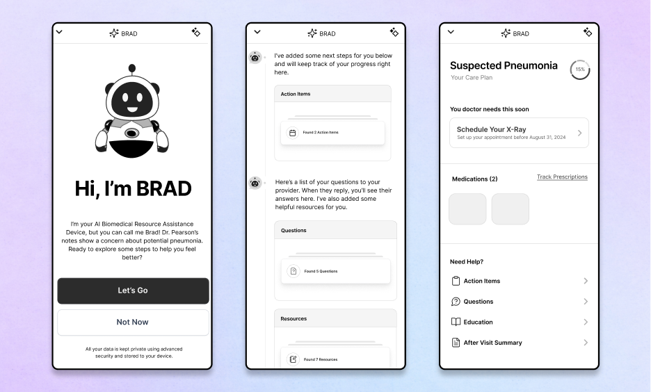
I realized I couldn't just give patients an open text box and say, "Ask anything." That was too broad; it invited the model to guess. Instead, I had to narrow the aperture. I moved from Generative (asking the AI to write new advice) to Extractive (asking the AI to translate existing advice).
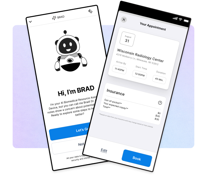
Concept 1: The "Blue Sky" Companion (High Ambition)I started with the futuristic ideal: a real-time, opt-in chatbot that acted as a side-by-side partner for the patient. Imagine an AI that "shows up" the moment you leave the clinic, ready to answer any question.
Concept 2: The Logistics Solver (Contextual Focus) I pivoted to address the patient’s "secondary" anxiety: the logistics of being sick. This concept focused on an interface that knew the patient’s context—their location, their billing info, their calendar—and helped them navigate the friction of scheduling and insurance.
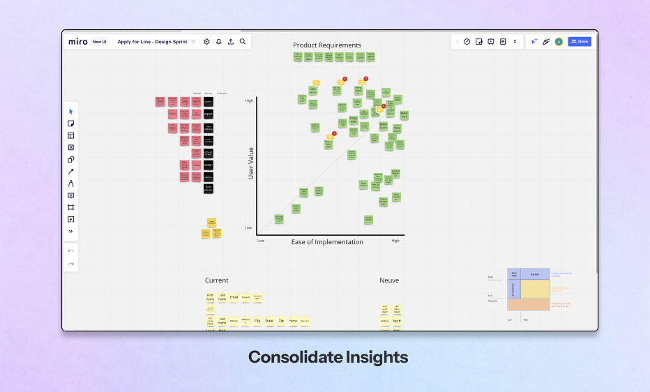
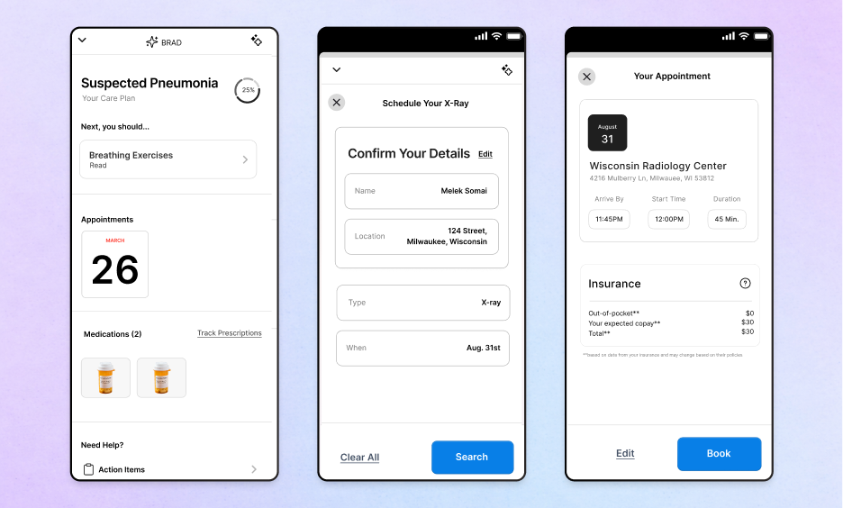
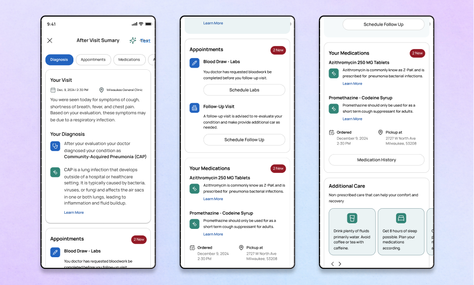
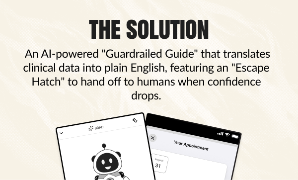
Concept 3: The Modular Dashboard (The "Safe" Reality)This was our breakthrough. Instead of one giant brain trying to do everything, we broke the AVS down into tightly controlled modules: Summary, Medication, Appointments.
Even with a modular design, safety was paramount. I collaborated with Myk, our lead engineer, to define the "Escape Hatch."The Escape Hatch is the specific moment the AI realizes it doesn't know the answer. I worked to define the model’s "voice" to be humble: to admit uncertainty and immediately hand off to a human care team member. I wasn't just designing a feature; I was codifying trust.
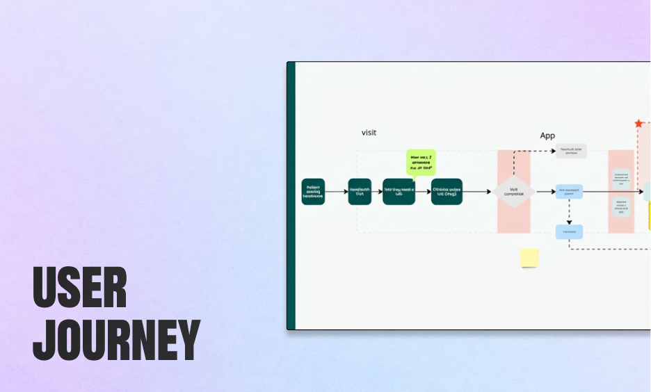
I started this project with a clear plan: we would launch with Pneumonia. It was the "safe" design choice—a linear condition with low variability. I had the user journeys mapped and the interface polished.
But everything changed when I showed the prototype to Dr. Kothari, a lead oncologist.
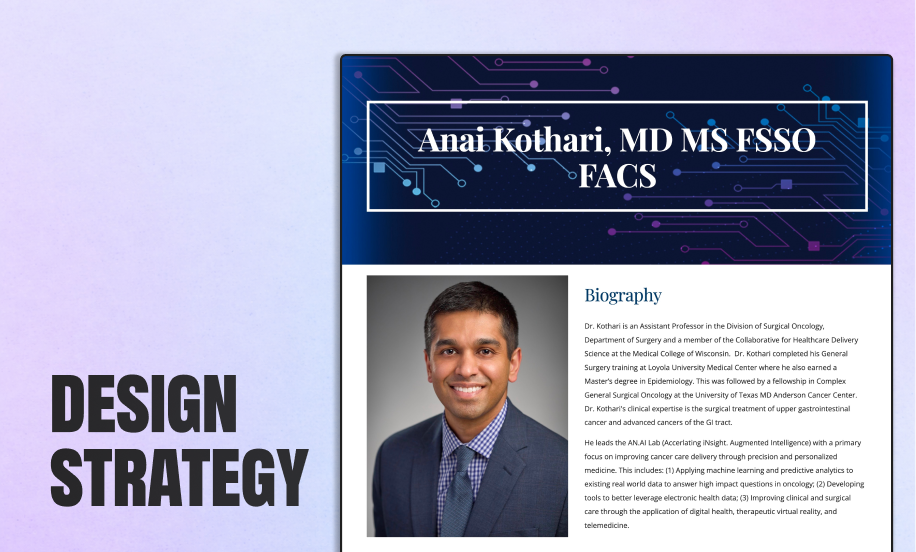
He didn't just see a tool; he saw a lifeline for his most overwhelmed patients. He immediately wanted this for Oncology. I realized I had a critical decision to make. I could cling to my "safe" Pneumonia designs, or I could pivot the entire project to align with a powerful internal champion. I chose the pivot.
I willingly scrapped the Pneumonia roadmap and re-oriented the entire design strategy around cancer care. This wasn't just a design choice; it was a stakeholder management choice. By aligning with Dr. Kothari’s vision, I secured the resources, clinical access, and executive buy-in that the Pneumonia concept never would have had. I traded the "easy" build for the path that actually had the organizational support to succeed.
I designed a pilot for 200 cancer patients—targeting lower anxiety and fewer repeat calls. However, leadership (Dr. Somai and Dr. Crotty) made a hard call: in a merger with ThedaCare, the urgent overtook the important. The product was paused before shipping. However, the work changed how I design for healthcare. I proved that you can respect the constraints of legacy systems (Epic) while still delivering a human-centered experience.
Ultimately, the merger with ThedaCare paused the pilot, but the work survived. We didn't just build a prototype; we built a philosophy for how AI should operate in high-stakes environments.
The patterns I defined—The Escape Hatch for safety, The Modular Design Patternfor hallucinations, and the Translation Layer for clarity—became the standard for how our team approaches LLMs. We proved that you don't have to choose between the rigid compliance of Epic and the human needs of a patient. You just have to design the bridge between them.
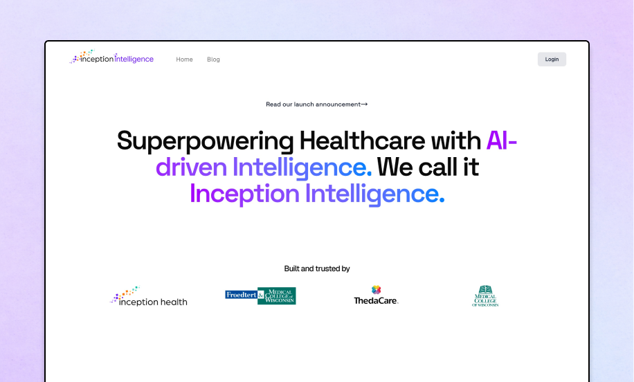
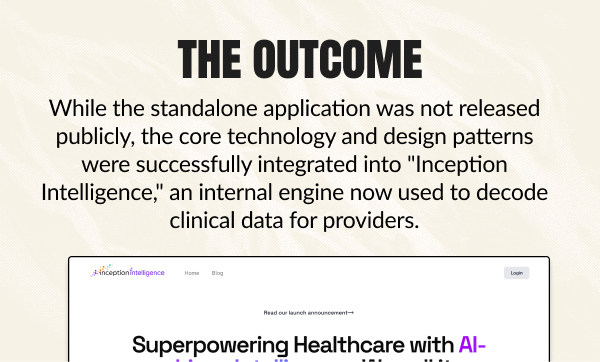
While the standalone application was not released publicly, the core technology and design patterns were successfully integrated into "Inception Intelligence," an internal engine now used to decode clinical data for providers.
Next Case Study
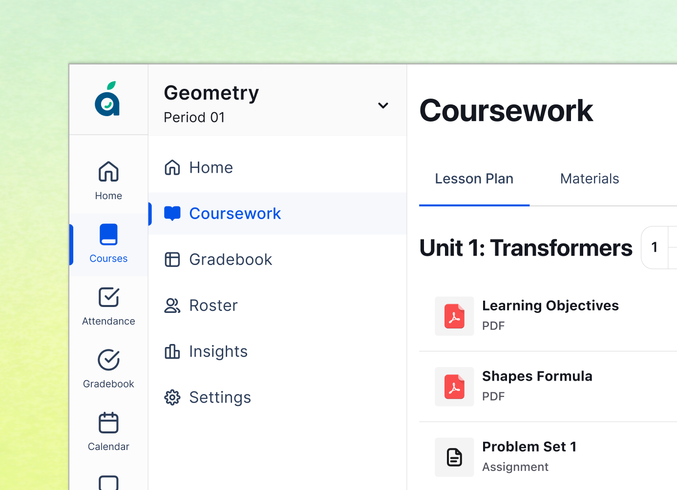
Reimagining the K-12 operating system by consolidating fragmented tools into a single, schedule-aware workflow that saves teachers 45 minutes a day.
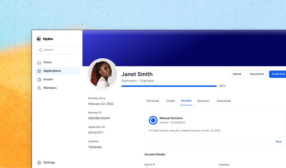
Clearing a 92% backlog by designing a 'Glass Box' AI interface that increased application processing speed by 1200% in just three weeks.
"Designing the first 'Dynamic CVV' experience that bridges the physical and digital worlds, reducing card-not-present fraud by over 95%